90s and 2000s aesthetics: styles, colors and design
Published
Use this guide to distinguish Webcore, Y2K, Frutiger Aero and related 90s and 2000s styles. Start with the visible clues—materials, color, typography and composition—then open the matching guide for examples, history and making instructions.
On this page
Retrospective labels organize different kinds of material. The Consumer Aesthetics Research Institute documents research and naming around these visual cultures. Its timeline records Evan Collins investigating turn-of-the-millennium imagery in 2013, then assembling and discussing the developing Y2K category in 2014. Those later research dates differ from the production dates of the designs the researchers collect. Keep both when explaining a style’s history.
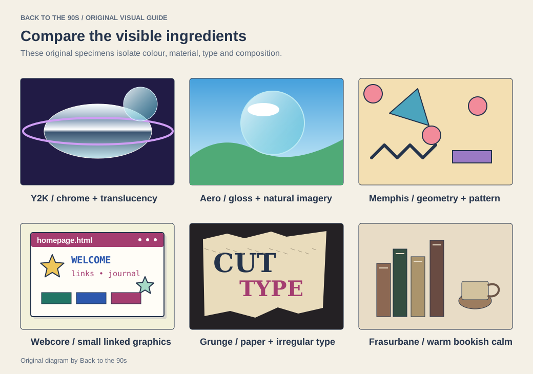
Compare the specimens through four visible choices: color, material, type and composition.
Choose a first visual family
| What catches your eye | Start here |
|---|---|
| Linked personal pages, small graphics and expressive interfaces | Webcore |
| Chrome, translucent plastics and an optimistic digital future | Y2K and Clear Tech |
| Gloss, water, sky and friendly interface depth | Frutiger Aero |
| Bright geometry, playful pattern and strong color | Memphis |
| Torn edges, rough printing and irregular typography | Grunge typography |
| Warm browns, bookish composition and domestic calm | Frasurbane |
Follow a more specific detail
A precise technical composition may lead towards Vectorheart or Metalheart. A soft, cool urban image may fit the Gen X Soft Club guide. A warm illustrated menu or package may point towards Global Village Coffeehouse.
For later reinterpretations, explore Vaporwave, Neo-Y2K and Cybertwee. Keep the original period and the later creative response in view as you compare them.
Compare the same four features
| Feature | Useful description |
|---|---|
| Color | Silver and icy blue; warm brown and cream; saturated pink and yellow |
| Material | Simulated chrome, translucent plastic, glossy water or printed paper |
| Type | Extended geometric letters, rough distressed forms or a restrained serif |
| Composition | Dense layers, open space, repeated geometry or a central illustration |
A chrome title alone does not identify every part of a design. Compare several features together, then use the linked examples to test the match.
Explore the creators and the medium
The net.art guide treats the browser as part of an artwork. Glitch art examines the image inside a digital error. The demoscene explores computers as a performance medium.
Make a small specimen
Choose one project: a pixel image, an 88×31 button or a personal website. Use the font resources and wallpaper collection for concrete starting points.
Keep the source, creator and date beside each reference. Then describe which features you carried into your original work.