Neo-Y2K: how contemporary designers remake the style
Published
Neo-Y2K reworks graphics from around 2000 for today’s music, clubs and digital art. Artists such as Froyo Tam and Terrell Davis give chrome lettering, invented objects and intense colors new subjects. Look for what each creator keeps and changes.
On this page
Put the revival on its own timeline
The Consumer Aesthetics Research Institute dates the Neo-Y2K revival from the late 2010s onwards. It highlights intense color, East Asian graphic-design influences and the complex forms of Metalheart. It names artists and designers including Froyo Tam, Terrell Davis, Arixant, Doss and DV-i.
Froyo Tam connects collecting with making
Froyo Tam describes her design, photo and animation work. She also works with the Y2K Aesthetic Institute.
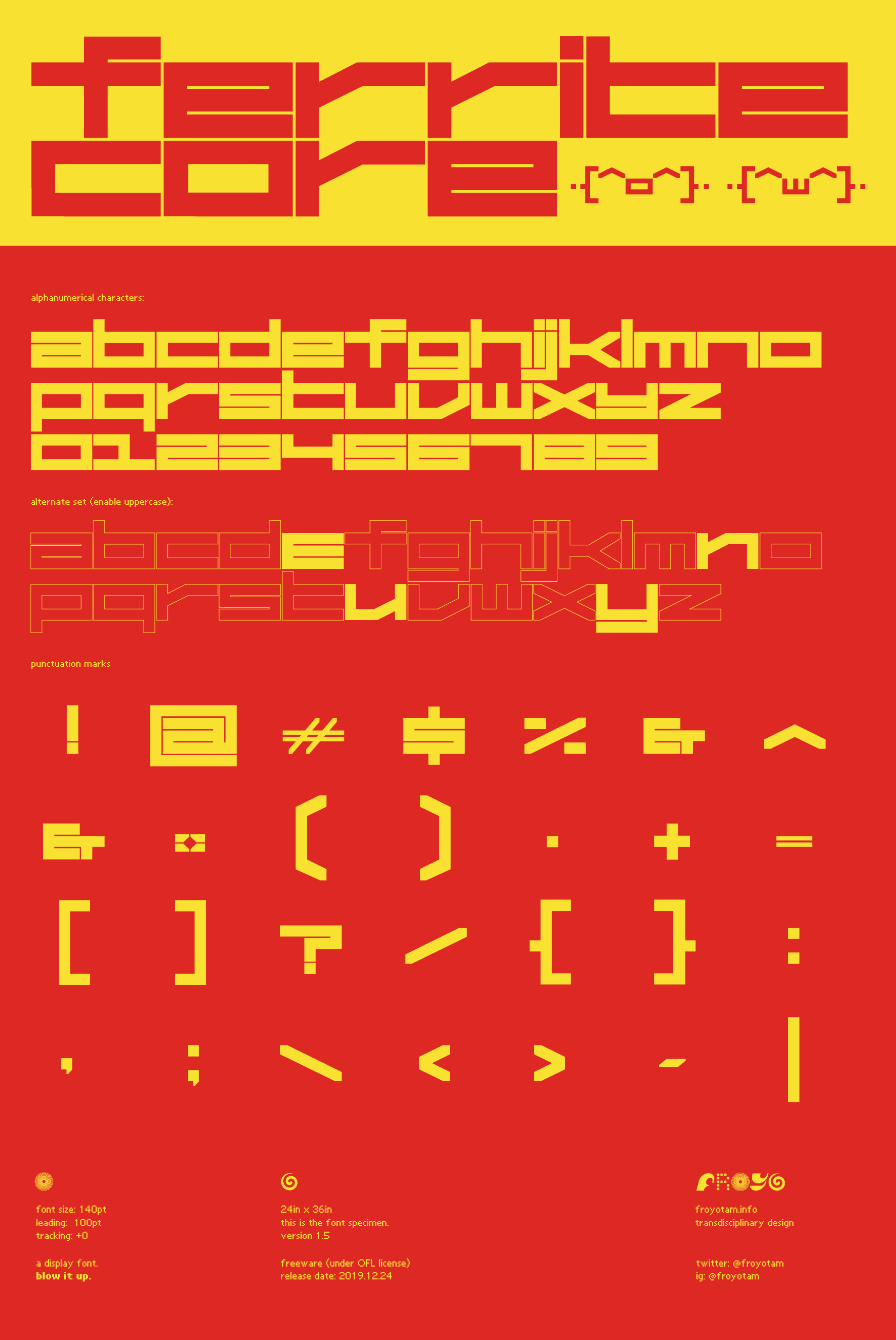
Her announcement of the typeface Ultra Hi-Gloss offers a concrete example. A font needs a full set of letters that work together. It must suit many words and sizes, so designing one takes more than copying a single old logo. Tam’s Ferrite Core archive dates version 1.5 to 24 December 2019.
Compare the letters before looking at the effects. Check their width, joins, ends and the spaces inside them. A letter can have a distinct shape in plain black; chrome and glow change its surface.
Terrell Davis makes the reference personal
In his 2020 interview about digital art, Terrell Davis talks about his early drawing, web collages and graphic design. The interview shows his art for Andrea Valle’s single “Lovergirl”.
Davis combines games, web images and music videos in his own bright, busy style. His taste shapes which details he chooses and how he puts them together.
Find the largest shape, the strongest highlight and the boldest color. Notice how the title and image share the frame.
Label the source and the new work
Keep two dates in a revival reference sheet: the source object’s date and the new work’s date. Compare a period object from the Y2K guide with one of the named artists’ projects. Identify one feature that survives and one that changes.
Use our Y2K font guide to check which fonts date from the 1990s and which came later.
Choose the part of Y2K that serves your project
| Starting point | Contemporary design decision |
|---|---|
| Reflective lettering | Draw a new name or logo and choose where its highlights lead the eye. |
| Invented 3D forms | Draw an object with a clear outline and a surface that suits its mood. |
| Tiny technical labels | Give a fictional system a consistent naming and numbering scheme. |
| Intense digital color | Choose a few colors that keep text and images distinct. |
| Dense abstract structure | Make one part stand out and leave clear space around the edges. |
Dense 3D shapes also define Metalheart. Flat symbols, compact lettering and repeated logos lead towards Vectorheart.
Build a remix with a clear intention
Make a poster for an imaginary listening session. Write a title, a date and a one-sentence description before you draw.
Choose one feature from an older design: a liquid-looking surface, an oval shape or narrow headline letters. Draw your own version and choose new colors around it. Keep the event information readable at phone size.
Create three versions that change only one major choice. Try the same form in silver, pink and matte green, or move it from an open layout to a crowded one. Explain what each version makes the event feel like.
Explore related styles in the 90s and 2000s aesthetics collection.