Y2K fonts: 18 free fonts for the 2000s look, with previews
Published
A Y2K title starts with its letter shapes. Rounded corners suggest moulded plastic; wide, interrupted strokes suggest a futuristic instrument panel. Choose that structure first, then add silver, color or transparency around it.
On this page
This guide pairs three documented 1990s designs with two newer display families. The local starter includes Orbitron and Audiowide, their original font licenses, a stylesheet and an editable specimen page.
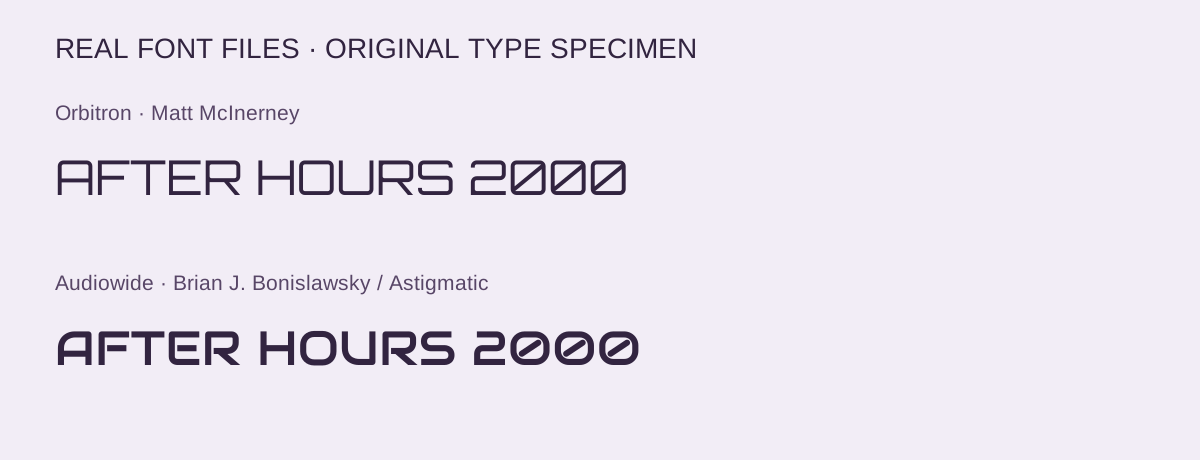
Download the Orbitron and Audiowide starter — ZIP, 98 KB · Open the editable specimen
18 free Y2K fonts
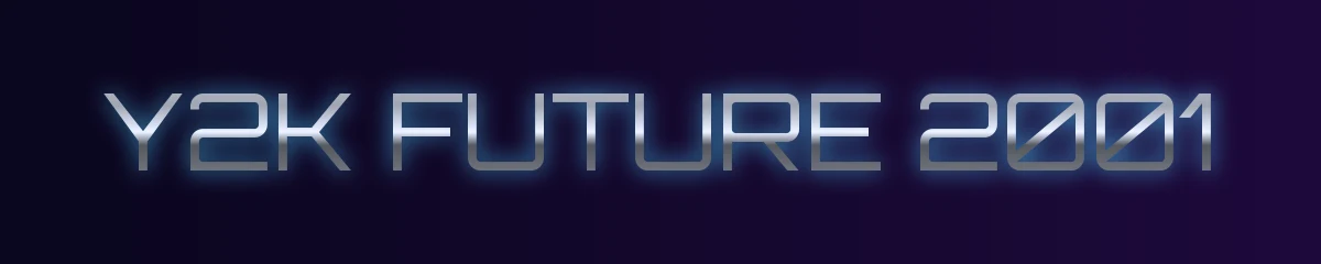
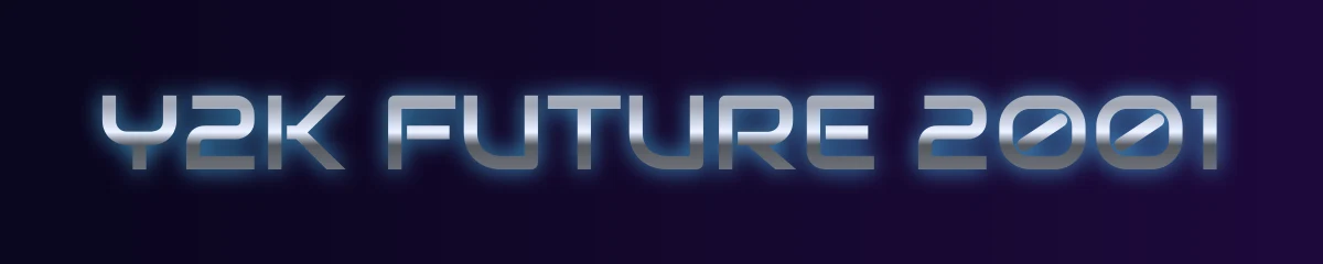
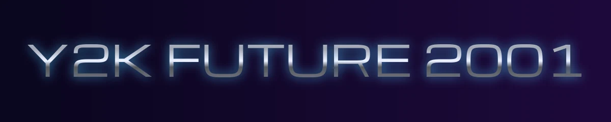
These free fonts cover the main Y2K looks: wide techno capitals, rounded tech shapes, neon lines and early-computer pixels. Chrome effects come from color and highlights, not from the font itself, so pick the shape first and add the shine afterward.
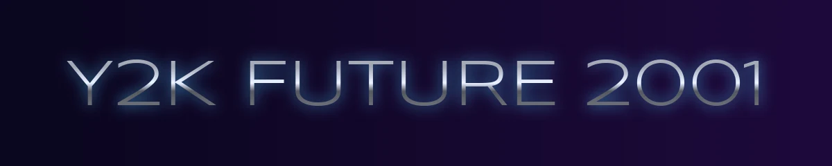
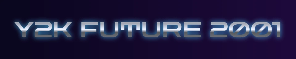
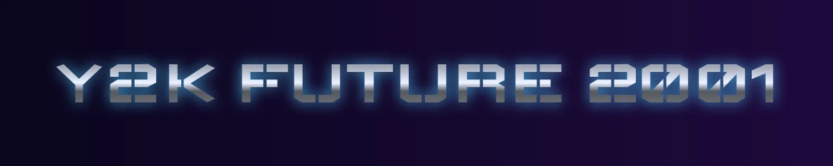
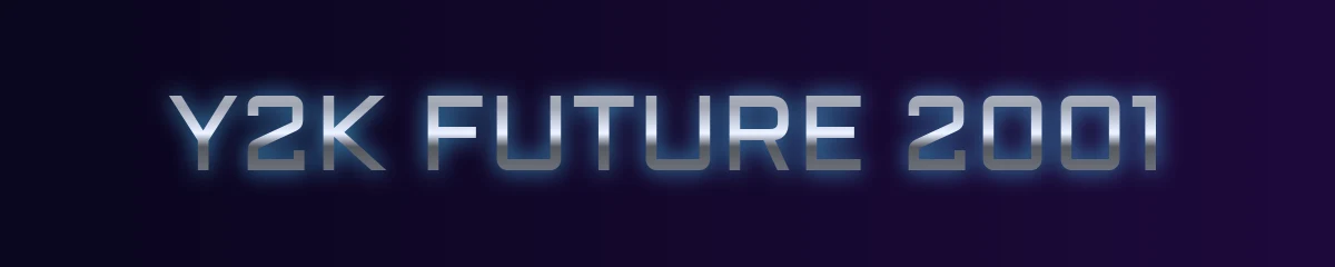
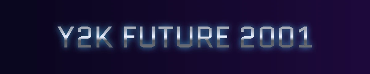

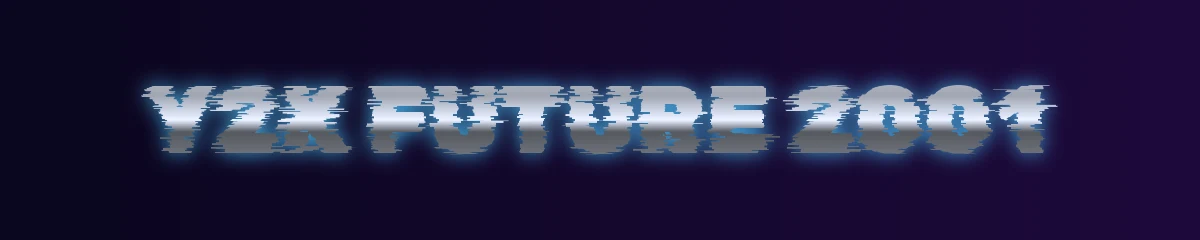
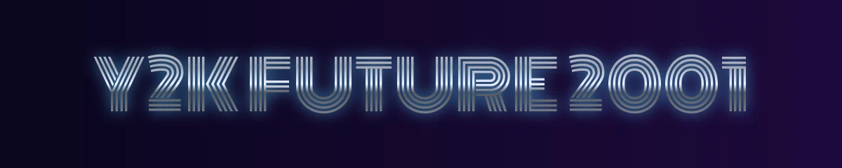
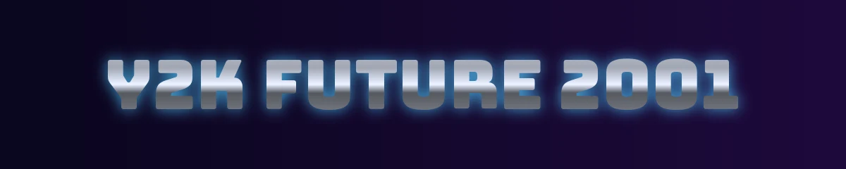
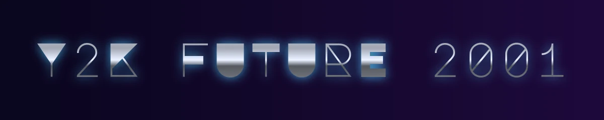
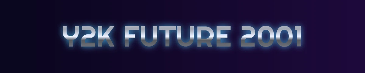
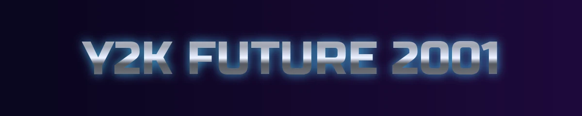
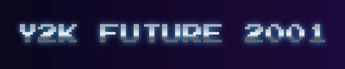

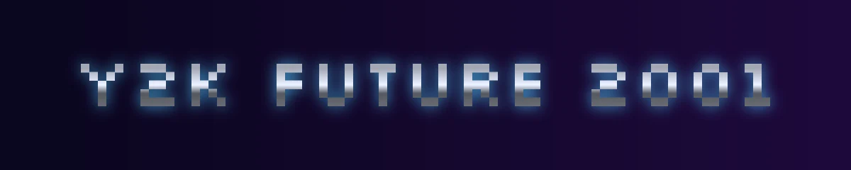
| Font | Style | Designer | License |
|---|---|---|---|
| Orbitron | Wide geometric techno capitals, the classic “future” look | Matt McInerney | SIL Open Font License |
| Audiowide | Rounded, wide tech letters for logos and titles | Astigmatic | SIL Open Font License |
| Michroma | Wide, clean letters in the spirit of Eurostile | Vernon Adams | SIL Open Font License |
| Syncopate | Very wide, minimal capitals for spaced-out headings | Astigmatic | Apache License 2.0 |
| Zen Dots | Soft rounded tech shapes with a playful edge | Yoshimichi Ohira | SIL Open Font License |
| Wallpoet | Stencil-like digital letters for a club-flyer feel | Lars Berggren | SIL Open Font License |
| Aldrich | Squared industrial forms for interface labels | MADType | SIL Open Font License |
| Quantico | Squared letters with a bank-gothic, sci-fi tone | MADType | SIL Open Font License |
| Iceland | Narrow squared letters, like an early digital display | Cyreal | SIL Open Font License |
| Rubik Glitch | Heavy letters with built-in glitch cuts | NaN, Luke Prowse | SIL Open Font License |
| Monoton | Multi-line neon-tube capitals for big titles | Vernon Adams | SIL Open Font License |
| Bungee | Bold vertical-signage letters that suit stickers and badges | David Jonathan Ross | SIL Open Font License |
| Major Mono Display | Geometric monospace with a computer-lab feel | Emre Parlak | SIL Open Font License |
| Righteous | Rounded deco-tech letters, friendly but futuristic | Astigmatic | SIL Open Font License |
| Russo One | Heavy techno sans for sporty, game-box titles | Jovanny Lemonad | SIL Open Font License |
| Press Start 2P | 8-bit arcade pixels, best at small sizes | CodeMan38 | SIL Open Font License |
| VT323 | Old computer terminal text | Peter Hull | SIL Open Font License |
| Silkscreen | Tiny pixel font that defined early web buttons | Jason Kottke | SIL Open Font License |
Each font is free on Google Fonts under the license shown, and both licenses allow personal and commercial use. Samples are rendered from the official font files in the Google Fonts repository.
Use them in Canva, Google Docs and CapCut
- Google Docs and Slides: open the font menu, choose More fonts, search the font name and add it. Fonts from Google Fonts appear there.
- Canva: search the font name in the font list. If it is not there, a Canva Pro account can upload the font file you downloaded from Google Fonts.
- Your computer: download the font from its Google Fonts page and open the file to install it. It then appears in apps like Photoshop, Word and CapCut desktop.
Want the whole web in Y2K type? Back to the 90s restyles the websites you visit with 90s and Y2K looks, fonts and effects, no code needed.
Choose a shape and a source
| Typeface | Designer | Useful direction | Download and terms |
|---|---|---|---|
| Neuropol, 1996 | Ray Larabie | Rounded technical lettering | Typodermic’s CC0 collection |
| Neurochrome, 1997 | Ray Larabie | Reflective, bevelled lettering | Typodermic’s CC0 collection |
| New Brilliant, 1998 | Ray Larabie | Wide letters with deliberate gaps | Typodermic’s CC0 collection |
| Orbitron, a later display family | Matt McInerney | Squared geometric headings | Included starter; League source and OFL |
| Audiowide, a later display family | Brian J. Bonislawsky / Astigmatic | Rounded, flowing technical headings | Included starter; project source and OFL |
Typodermic dates Neuropol to 1996 and New Brilliant to 1998 in its public-domain index. Its Neurochrome account dates the reflective design to 1997 and describes turning Neuropol into bevelled letters in LightWave. The foundry supplies desktop OTFs and WOFF2 webfonts under CC0; use its individual entries or collection downloads.
Try Neuropol for a compact technology heading. Give New Brilliant a wider line so its interrupted strokes have room to read. Both choices gain strength from short wording and clear spacing.
Orbitron and Audiowide offer a practical starting point for a new design. Compare the corners, open spaces and width of the same phrase, then choose the family that fits your layout. The supplied Orbitron file supports weights from 400 to 900; Audiowide supplies its regular style.
Compare the live text
These samples load the included font files. In the editable specimen, set “RADIO MIX 2000” in both families at the same size. Compare O, A and I, then inspect the gaps inside and between letters.
Orbitron
SIGNAL 2000
Matt McInerney · Official source · SIL OFL 1.1
Audiowide
Silver frequency
Brian J. Bonislawsky / Astigmatic · Official source · SIL OFL 1.1
Build a title that reads at its final size
Start with dark letters on a pale background. Set the exact words you intend to use and view the design at the size your reader will see. Look closely at the narrow gaps inside letters and the space between neighboring characters.
Next, add a single material effect. A broad highlight across a silver title gives the letters a reflective surface; a colored outline can connect them with a translucent panel. Keep enough contrast around the outer shape to preserve the word when you shrink it.
Our Y2K chrome text tool helps you explore a reflective title. The Y2K visual guide shows how that title can sit beside plastic, chrome and small digital details. Pair a distinctive heading with a simple reading face for paragraphs.
Use the included files on a website
Keep the fonts directory beside specimen.css and specimen.html. Open the HTML file to try the complete local example. This CSS shows the same loading method for Orbitron:
@font-face {
  font-family: "Orbitron";
  src: url("fonts/Orbitron-wght.ttf") format("truetype");
  font-weight: 400 900;
  font-style: normal;
  font-display: swap;
}
.site-title {
  font-family: "Orbitron", sans-serif;
  font-weight: 600;
}
The browser resolves the font path from the stylesheet’s location. MDN’s @font-face reference explains the source and weight descriptors if you want to adapt the example.
Orbitron and Audiowide carry the SIL Open Font License 1.1. Keep their copyright and license files with the fonts when you share the starter. Back to the 90s shares the original specimen layout and CSS under CC BY 4.0.
Browse the 90s and 2000s aesthetics collection for the histories behind these visual choices.