Y2K aesthetic: translucent tech, chrome and digital style
Published
Y2K means “year 2000”. The digital Y2K look comes from late-1990s and early-2000s technology. Think of partly see-through computer cases, metal-like letters, glossy controls and software you can dress up yourself.
On this page
What makes something look Y2K?
Look at the materials first. Colored plastic and polished metal give even a simple shape its own character.
| Look for | What it does | Try it in your own design |
|---|---|---|
| Translucent colored plastic | Lets you see some of the machinery through the case | A clear blue or orange frame around one main element |
| Chrome and liquid metal | Makes ordinary lettering feel like a futuristic object | One reflective heading, with plain text underneath |
| Gloss and soft highlights | Makes a button feel raised, rounded and touchable | A bright upper edge and a darker lower edge |
| Curves and unusual outlines | Gives equipment a playful, sculpted shape | Rounded tabs, an oval panel or a deliberately odd window |
| Dense little controls | Makes software feel like a personal machine | A compact player or toolbar with clear labels |
Evan Collins started studying this look in 2013. In 2014, he collected designs from roughly 1996–2003. The Consumer Aesthetics Research Institute (CARI) tells the story of that research. CARI project history
Explore the iMac, Aqua and Winamp
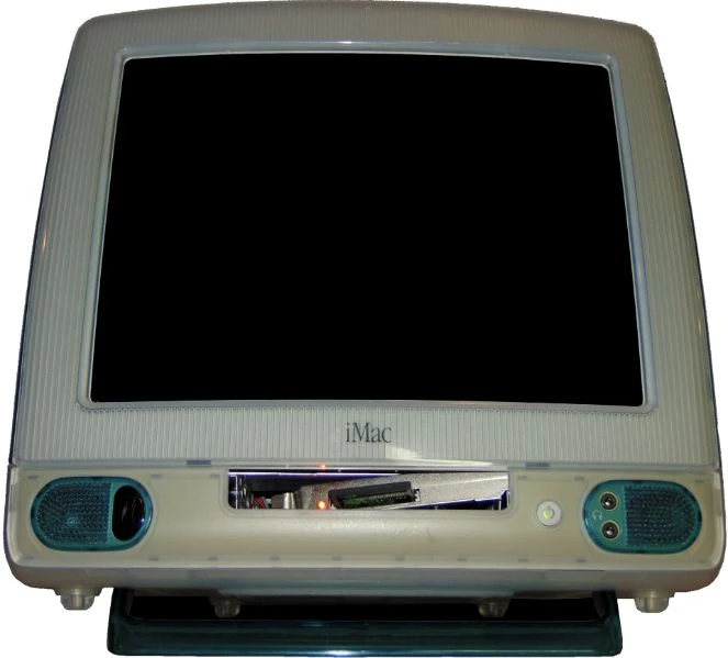
1. The iMac turned its case into the attraction
MoMA dates the original iMac in its collection to 1998. Its case uses polycarbonate, a type of plastic. Look at the curved shell, the blue edges and the casing around the screen. MoMA collection record
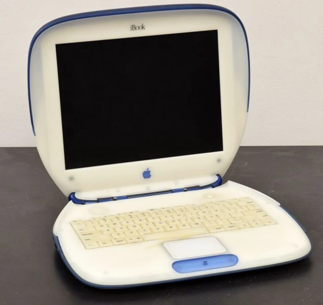
The clamshell iBook brings a colored outer edge and rounded body to a laptop.
2. Aqua put the shine inside the screen
Apple unveiled Aqua on 5 January 2000. Its buttons, scrollbars and windows glowed and let some of the background show through. It also introduced animated effects and the Dock, a row of app shortcuts. Apple later named 24 March 2001 as the Mac OS X release date. Apple’s Aqua announcement · release announcement
A small highlight makes a flat rectangle look like polished plastic. A partly transparent panel lets you see what lies behind it. Try the effect on one button or window, then use a plain background behind the text.
3. Winamp skins made software personal
Skins change a music player’s appearance. Visit the Winamp Skin Museum and look at how much personality people packed around a play button. Some skins resemble stereo equipment. Others turn the player into a colorful toy, a science-fiction panel or a small piece of fan art.
Jordan Eldredge collected skins to test his Webamp player. He then worked with the Internet Archive to save them. The preservation story
Try Webamp, Eldredge’s new version of Winamp 2 for browsers. It supports classic skins. Webamp project
Switch between a few skins and watch the personality change around familiar controls.
Y2K, Webcore and Frutiger Aero: which look do you mean?
| If you want… | Start with… | Details to notice |
|---|---|---|
| A homemade corner of the internet | Webcore | Personal links, tiled backgrounds, tiny graphics and visible enthusiasm |
| A shiny turn-of-the-millennium future | Digital Y2K | Colored plastic, metallic surfaces, curves and custom software skins |
| Glassy technology with fresh, natural imagery | Frutiger Aero | Transparent surfaces, soft light, greenery and glossy interfaces |
CARI dates Frutiger Aero mainly to 2005–2013. In 2006, Microsoft described Windows Vista’s Aero through glass, reflections and animation. CARI guide · Microsoft announcement
Choose a period reference or a contemporary remake
Ray Larabie’s Typodermic archive dates Neuropol to 1996. Neurochrome followed in 1997. To make Neurochrome, he used LightWave to give Neuropol’s letters a shiny surface and sloping edges.
Use our Y2K font guide to tell period fonts from later designs. Try the original Y2K wallpapers for new graphics you can edit. Compare McBling’s decorated fashion objects with Neo-Y2K’s new remixes. Choose the part of Y2K you want to explore.
Build a version you actually want to use
Clear blue computer. Choose pale blue, white and one deeper teal. Give your main panel a rounded, partly transparent frame. Leave some empty space around it.
Chrome music player. Use charcoal, silver and one bright accent color. Keep labels crisp. Save the metallic effect for a heading, border or player.
Colorful personal desktop. Choose a favorite color, a cursor you like and one moving detail.
Test the finished setup on a page you read every day. Check a paragraph, a button and a link at normal zoom. If a shiny effect covers the words, move it to the frame or headline.
Explore Back to the 90s to bring your favorite look into your browser. Follow the Webcore visual guide for the homemade side of the era. Visit these 90s websites and archives to explore the original web.
Explore related styles in the 90s and 2000s aesthetics collection.