McBling and Y2K: fashion, phones and visual differences
Published
McBling uses shine to create glamour. Think of rhinestones (small imitation gems), large logos, decorated phones and letters that look like jewelry. Digital Y2K often makes the technology itself look futuristic. McBling makes an object part of its owner’s look. It could be a tracksuit, a handbag or a fashion phone.
On this page
What McBling adds to the picture
The Consumer Aesthetics Research Institute’s McBling entry gathers examples from across the 2000s. It shows luxury looks, fashion phones, decorated electronics, fancy letters and brands such as Juicy Couture.
Many designs mix digital Y2K’s futuristic materials with McBling’s glamour.
Look at the tracksuit and fashion phones
The Metropolitan Museum of Art records a Juicy Couture tracksuit dating to about 2004. Look at where the logos and decoration sit on the jacket and trousers.
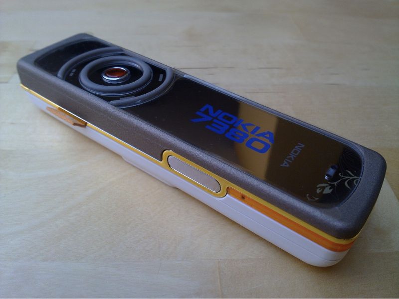
Phones offer another example. The Mobile Phone Museum’s Nokia 7380 record dates its announcement to October 2005. It was part of Nokia’s L’Amour collection. Its narrow body, reflective face and decoration make the phone look like a fashion accessory.
Motorola’s 2005 annual report describes more RAZR colors. It also names a Dolce & Gabbana gold edition.
Compare McBling with digital Y2K
The dated garments and phones show why color alone cannot identify the style. Examine a pink device’s shape, finish, branding and accessories together.
| Detail | Digital Y2K reading | McBling reading |
|---|---|---|
| Reflective surface | A futuristic shell or liquid-metal form | Jewelry-like shine and decorated lettering |
| Device | An unusual technological object | An accessory that helps present a look |
| Graphic focus | Curves, chrome and technical details | Hearts, glints, decoration and large logos |
The original McBling wallpapers let you test repeated hearts, diamonds and glints without borrowing a brand logo.
Separate sparkle from reflection
Sharp light and dark bands inside the letters suggest a reflective surface.
A reflective finish makes the letters look like metal. Sparkle draws attention to chosen points. You can combine them, but make one part stand out first.
When you study a graphic, look for the largest word first. Then follow the decoration around it. Do curls frame the title? Do small stars form a diagonal? Does a contrasting outline keep the letters clear against the background?
Make a small lettering study
Open the Y2K text generator and enter a short name or title. Choose Chrome to compare reflective bands with Glitter for scattered points of light. Keep the words and background the same while switching the effect.
Export a PNG image to put on a page. Choose SVG if you want to edit the letter shapes. Put the date, place and other key details in plain text beneath it. Readers can then find them easily.
Follow the lettering into album art
Pen & Pixel’s album covers combine letters that look like jewelry with busy scenes made from photos. Compare the size of the artist’s name, where the glints fall and which objects suggest wealth or fame. Superflat Pop shows how the same images appear in art and on products.
Explore related styles in the 90s and 2000s aesthetics collection.