Pen & Pixel: the studio behind lavish rap cover art
Published
Pen & Pixel built lavish rap covers from studio portraits, layered digital scenes and huge lettering. A performer might sit among cars, jewelry or an invented skyline. The Houston studio made those objects part of the artist’s public image. The name and portrait compete for attention inside one square.
On this page
Follow the studio’s own archive
The University of Houston’s Pen & Pixel collection documents the company that Shawn and Aaron Brauch founded in 1992. It preserves album artwork, promotional material, photographs and a catalog. It explains how the studio combined portraits, layered digital settings and decorated letters.
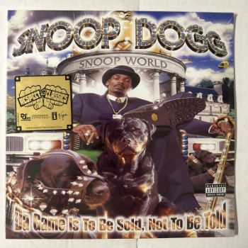
The library’s 1998 Snoop Dogg poster flat credits Pen & Pixel Graphics and No Limit Records. The object description identifies a throne, two dogs, cars and decorative lettering around the performer.
Those elements have different roles. The portrait identifies the artist. The objects around the artist suggest a place and a way of life. Bold lettering makes the release easy to spot in a crowded shop or a small image.
Record the artist, release and label
The collection documents clients including No Limit and Cash Money. Record the artist, release and label alongside each cover.
Read the portrait’s place in the scene
Compare the body’s size with the objects around it. A larger portrait can make the performer dominate the scene. A view from below can make the performer seem larger. The position of the head and the space around it also determine how easily the viewer recognises the person.
Next, follow the overlaps. An object in front of the performer looks close; a building behind them looks far away. These overlaps create depth even when the pictures come from different sources.
Lettering supplies another kind of object
Treat the title as something with shape and weight. A thick outline can separate it from a complicated background. Highlights can make it feel metallic. Closely packed letters can create a solid block across the upper part of the image.
Try covering the title and then the portrait as you study a reference. What does each tell you that the other does not? Large, solid letters can make the name stand out as much as the performer.
Compare the lettering with the material discussion in McBling. Jewelry-like details, reflections and decoration add shine. Ask how those choices fit the artist and release.
A collage still needs a reading order
Look for a first, second and third point of attention. Size, contrast, sharpness and placement all help establish that order.
View the cover very small. You should still see the main shapes even when the fine details disappear. Then enlarge it and inspect the smaller objects. They may set a mood, add a joke, tell a story or show something about the performer.
Compare the bright areas, shadows and colors across the layers. Light from the same direction can make separate photos look like one scene. Stronger highlights or deeper shadows can make it feel more dramatic.
Try an original cover exercise
Invent a performer and a release title. Use a portrait you make yourself or draw an original figure. Choose a setting and two supporting objects that connect to the invented release’s subject. Write down the reason for each object before placing it.
Build the cover in large shapes first. Place the portrait, then the title, then the setting. Add the other objects where they lead the eye between those parts. Save this rough version to compare with the finished cover.
Finally, view the cover as a small square and as a larger poster. Adjust the lettering and portrait until the same artist and release are clear in both sizes. If the portrait and title compete, change their size or overlap before adding another object.
Explore related styles in the 90s and 2000s aesthetics collection.