Vectorheart: Wipeout, symbols and futuristic graphics
Published
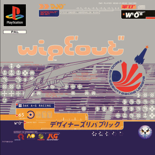
Vectorheart makes fictional teams and brands look futuristic. It uses flat symbols, compact lettering and grids of technical-looking details. A racing-team emblem, a number and repeated colors can suggest a whole team or brand. Readers should recognize them on a vehicle, a cover or a small screen.
On this page
The style and its reference points
The Consumer Aesthetics Research Institute’s (CARI) Vectorheart entry names Bionic Systems and The Designers Republic as reference points. It links the style to futuristic shapes and lettering that stands out sharply. It also points to Swiss modernist design, with its clean type and grids, and industrial signs and labels. Flatheart is an alternate name.
CARI connects The Designers Republic with the look of Wipeout. Sony’s own PlayStation history dates the game to 1995. It was available when the console launched in Europe. Compare the game with its packaging and other graphics: the same symbols and brands appear across the fictional racing world.
Read a fictional brand as a complete system
Imagine a racing team. Its emblem appears on a vehicle. Its number tells you who is driving, and its colors set it apart from a rival. Draw those three uses before deciding whether the emblem needs another arrow or outline.
This makes Vectorheart a useful counterpart to Metalheart. Both can suggest complex technology, but Vectorheart’s flat symbols must stay clear at tiny sizes. Frutiger Metro uses sweeping curves and solid outlines of people or objects. If an image could fit both styles, compare its edges, spacing and lettering.
Check the symbol at three sizes
Test your symbol at 24, 96 and 384 pixels wide. At 24 pixels, inspect the narrowest gaps and remove cuts that merge. At 384 pixels, check the outline and the empty spaces between its parts.
Use one diagonal angle for the symbol, name and grid in your own design.
Make the type part of the system
Use a large name and small text beneath it so readers know where to look first.
Give the supporting information a purpose. Use a project name, a version number, a location or a short description that belongs to the fictional world you are building. Align those details to a small set of vertical and horizontal guides.
Use the same gap between items, the same line thickness and the same label style. Keep those choices even when a panel changes size.
Use color as a signal
Begin with one dark and one light color. Check the symbol and title in that pair before adding an accent color. Then assign the accent a role, such as showing the main team or marking a selected item.
A small patch of bright color stands out when you leave space around it. If you introduce a second accent, give it a separate meaning.
Design a believable fictional organization
Invent a racing team, a record label or a small research unit. Write one sentence describing what it does. Choose a name and three pieces of information that its audience would need.
Design a single symbol, then place it on a square cover, a narrow information strip and a simple screen header. Keep the symbol unchanged while adjusting its position and size.
Remove details one at a time and check what is lost. Keep the parts that help people recognize the team or brand and read its details. Explore digital Y2K for more design from the same years.
Explore related styles in the 90s and 2000s aesthetics collection.