Frutiger Metro: silhouettes, flat color and movement
Published
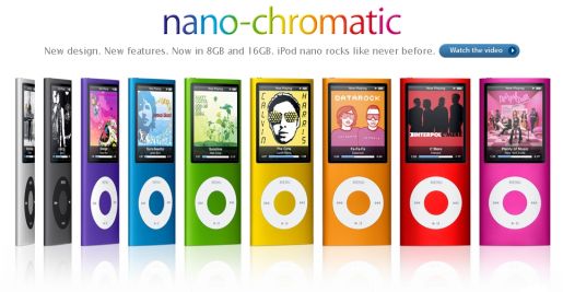
Frutiger Metro uses silhouettes: solid shapes of people or objects. Sweeping curves and bright blocks of color suggest movement. Music packaging and portable-player adverts supply many examples. A clear figure or headline draws the eye first, then colored bands lead it across the image.
On this page
Start with the community’s visual definition
The Frutiger Aero community’s Metro guide groups flat color, sweeping forms, silhouettes and lively graphic movement under the label. The name helps people group these images today.
To study a design, look at four parts: the main curve, the areas of color, the subject or symbol, and the text. A curve can make room for a headline, carry a shape across the page or connect several otherwise separate areas.
Explore Samsung’s YP-K5 packaging
Samsung’s history of its IFA launches identifies the YP-K5 music player at IFA 2006 and describes its built-in sliding speaker.
A community image collection preserves an example of K5 packaging. Compare the product image with the graphics around it. Which shapes suggest movement? Which areas leave the product easy to see?
Keep your notes concrete: a curve crosses a corner, a color repeats beside the product, or a small line of text sits in an open area.
Follow silhouettes into a campaign
Apple’s October 2004 U2 iPod announcement describes a campaign that combined its silhouette advertising with U2’s music video for “Vertigo”.
Look at the figure’s pose and size. Do they make it seem to move? The colors and empty space around it affect how much it stands out.
For an original exercise, choose a simple abstract shape or draw your own figure. Give it a clear pose or direction and try it in several positions before adding decorative detail.
Compare Metro, Aero and Vectorheart
Draw the same layout in three styles. Fill its curves with solid color for Metro; add transparent panels and soft reflections for Aero; introduce hard-edged symbols and compact technical lettering for Vectorheart. Keep the outline the same and see how surfaces and spacing change the result. Our Metro asset pack includes separate shapes with clear backgrounds for this experiment.
Build a curve that guides the eye
On a 1200 × 675 canvas, draw one curve from the lower-left edge to the upper-right edge. Make three copies, each the same distance from the next. Use different widths or flat colors while keeping a clear gap between the bands.
Now decide where the eye should pause. A wider curve can create a strong boundary; a narrow line can extend the movement. Leave a quiet area for a title and a smaller area for practical information.
Keep shapes flat and the reading order clear
Choose a dark background, two bright accent colors and one softer color. Decide where each belongs before repeating it.
Use a short title in a clear font. Make the other text smaller and line it up with one edge. Shrink the image to thumbnail size. You should still see the headline and the sweep of the curves.
Turn the study into a graphic you can use
Export a background and a version with your own title. Check both in the place you plan to use them: a desktop, a music page or a small event poster. Adjust the quiet areas around real icons and text.
Keep the editable shapes so you can change the colors and size later. Check that the curves still lead the eye when you switch from a wide screen to a tall phone background.
Explore related styles in the 90s and 2000s aesthetics collection.