90s fonts: Template Gothic, Remedy and Silkscreen
Published
The 1990s gave designers several very different ways to make letters expressive. Template Gothic brings an uneven printed rhythm, Remedy adds curling gestures, and Silkscreen turns a tiny pixel grid into a compact alphabet. Choose the one that serves the job: a distinctive title, a lively poster or a small website label.
On this page
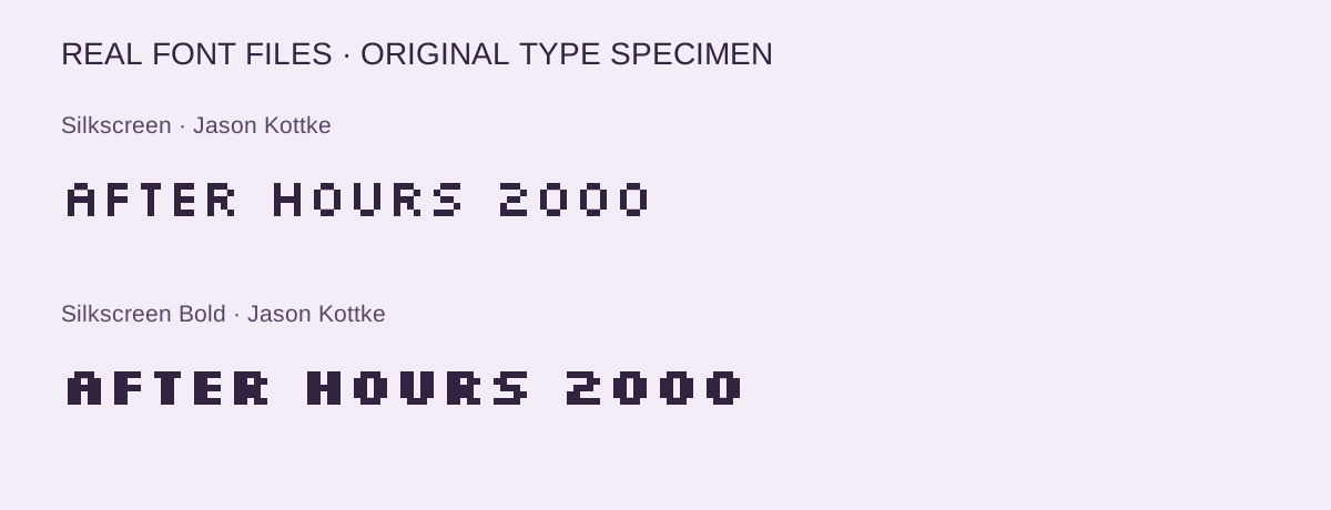
The three families below come from named designers and documented sources. Our downloadable starter gives you Silkscreen Regular and Bold, with the actual font files, their OFL license, CSS and an editable browser specimen.
Download the Silkscreen specimen starter — ZIP, 48 KB · Open the editable specimen
Three distinct directions
| Typeface | Designer and date | Try it for | Official source |
|---|---|---|---|
| Template Gothic | Barry Deck, 1990 | Uneven editorial headings | Emigre specimen and licensing |
| Remedy | Frank Heine, 1991 | Curling, expressive display words | Emigre specimen and licensing |
| Silkscreen | Jason Kottke, 1999 | Compact pixel labels and small graphics | Creator’s download page |
Template Gothic: let the irregularity set the rhythm
Barry Deck drew inspiration from a sign in his neighborhood laundromat. Emigre dates Template Gothic to 1990 and describes its relationship with imperfect reproduction. Look at how the uneven contours change an otherwise familiar sans serif structure.
Use the foundry’s tester to set a short editorial title. Give it plain surroundings so the letter shapes carry the character. Our grunge typography guide explores the wider relationship between type, reproduction and texture.
Remedy: give the flourishes some space
Frank Heine created Remedy in 1991. Its curving strokes and playful forms suit a short phrase with a generous margin. Emigre supplies alternate characters and ornaments alongside the family.
Try the actual headline in the foundry’s specimen before choosing a style. A curling letter can become the focal point of a cover, invitation or music graphic. Keep supporting dates, addresses and paragraphs in a calmer face so each level has a clear job.
Silkscreen: work with the grid
Jason Kottke announced Silkscreen in his August 1999 archive. His design account describes drawing the small characters in Photoshop and building the font in Fontographer.
Use the live samples below to compare Regular and Bold. Short labels show the difference clearly: Bold fills more of the small internal spaces, while Regular leaves a lighter rhythm.
Silkscreen
HOME / LINKS / NOTES
Jason Kottke · Official source · SIL OFL 1.1
Silkscreen Bold
NEW PAGE ONLINE
Jason Kottke · Official source · SIL OFL 1.1
Match the typeface to the scale
Try one poster title in Template Gothic or Remedy, then one navigation label in Silkscreen. Compare the results at the size the reader will see. Their different construction matters more than a shared decade: expressive contours, flourishes and tiny square forms each need a different amount of space. Use a plain reading face for paragraphs and reserve the display family for a heading or label. An original geometric wallpaper can supply a matching background.
Make a small graphic or a live heading
For a button, set the wording first and leave a consistent border around it. Check the result at its actual size, then export a PNG with clean edges. Our 88×31 button collection gives you finished original examples, and the button maker lets you build your own.
For a webpage, keep the words as selectable text and load the font through CSS. The starter includes two local styles with matching weight declarations. Its editable specimen lets you compare your own wording from 12 to 72 pixels.
Choose the license for your use
Emigre offers its own licenses for Template Gothic and Remedy. Choose its web license when you want the font to render live website text, and review the foundry’s license options for other uses.
The supplied Silkscreen files carry SIL OFL 1.1. Keep that license and the font’s copyright notice with any copy of the font you share. Back to the 90s shares the original specimen layout and CSS under CC BY 4.0.
Browse the 90s and 2000s aesthetics collection for the histories behind these visual choices.