Global Village Coffeehouse: earthy 90s graphic design
Published
Global Village Coffeehouse brings earthy color, curling lettering and rough, carved-looking marks to menus, packaging and posters. Cups, leaves, suns and irregular borders make the graphics feel handmade. The line matters as much as the colors: a blunt brush leaves rougher marks than a smooth digital curve.
On this page
What the name describes
The Consumer Aesthetics Research Institute’s Global Village Coffeehouse entry groups examples from the late 1980s through the mid-1990s. Compare the archived menus, packaging and posters to see how their lettering and drawn marks vary.
Study the Remedy typeface
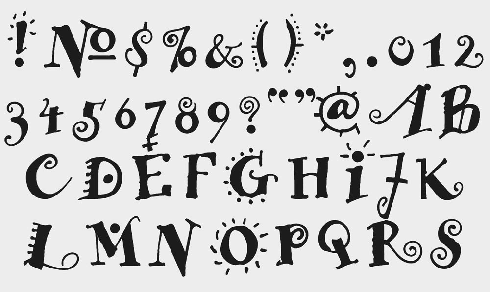
Emigre dates Frank Heine’s Remedy to 1991. Emigre supplies two stroke thicknesses, Single and Double, plus alternate letters and decorations. Compare one word in both versions to see how thicker strokes reduce the pale gaps around the letters.
Look at the relationship between a letter’s main stroke and its small curl. Compare repeated letters to see how using different versions changes the word’s shape. Then inspect the spaces inside and between the characters. A lively outline still needs room to remain readable.
Try writing a short heading by hand before choosing a font. Draw each letter’s basic shape, then alter one feature: a curved end, a raised or lowered letter, or a widening stroke. Keep the word recognizable as you add character.
Compare the lettering with other 90s designs
The 90s font guide places Remedy beside Template Gothic and Silkscreen. Remedy’s curves, Template Gothic’s uneven outlines and Silkscreen’s pixel grid give a heading three different shapes. Use the same words in each sample so you can compare the letters.
Let the line suggest a material
For your own study, choose a tool with a particular mark: a broad pencil, a brush pen or a blunt digital brush. Draw the same cup three times at the same size. Compare the edges, the pressure and the gaps. Select the version whose line best suits the subject, then carry that line quality into the border and small symbols.
Keep the texture at a useful scale. A rough edge should remain visible after you shrink the graphic. Large patches of speckling can dominate a small image; a few small gaps in the line can suggest a rough surface.
Make a palette with a strong dark color
Begin with a paper color, a dark drawing color and two accents. Cream, deep brown, muted green and terracotta create one possible combination. You can choose another set by sampling a real object, such as a ceramic cup or a painted sign.
Assign the colors jobs. Use the dark color for small text and outlines. Let the paper color hold the largest area. Place the stronger accent where you want the eye to pause. Repeat a small patch of color in two or three places to link them while leaving some space empty.
A menu still needs clear prices and headings; an event poster still needs a date and location. Use plain, clear text for those details and let the illustration set the mood.
Read the decorative references with care
A collection may place suns, spirals, globes and symbols borrowed from other cultures beside one another. Identify a symbol’s source when you can, and connect it to the actual brand or publication that used it. For an original design, draw from objects, places and experiences you know well. A cup from your kitchen or a leaf from your street gives you a precise starting point.
Gen X Soft Club offers another form of 1990s warmth through quiet photographs and simple lettering. Frasurbane moves towards classical objects and bookish presentation. Compare their borders and headlines: coffeehouse graphics give the drawn line a much larger role.
Explore related styles in the 90s and 2000s aesthetics collection.