Gen X Soft Club: muted color and urban graphic design
Published
Gen X Soft Club combines soft greens, grays and browns with city photographs and simple lettering. A street, a face or an ordinary room sets the mood; the layout leaves room to look.
On this page
What the name describes
The Consumer Aesthetics Research Institute (CARI) credits researcher Sloane Angel Hilton with the original Gen-X Young Adult Soft Club name. Its Gen X Soft Club entry connects the look to soft natural colors, city images, simple layouts and a mix of free-flowing and regular shapes. The archive places its examples broadly between the early 1990s and the mid-2000s.
Those features work as a group. Beige alone gives you a color. Add a closely cropped photograph, simple lettering and even margins, and the style becomes easier to recognize.
Study the All I Need music video
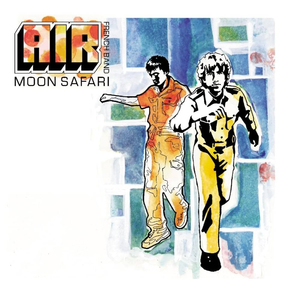
Watch Mike Mills’s 1998 video for AIR’s All I Need. Notice which parts of a person and their surroundings appear in the frame. See how one still image sets the mood. Mills also designed AIR’s 1998 Moon Safari cover, as Warner Music’s album announcement confirms.
Pause the video on a frame with a person and a visible setting. Sketch the subject, surrounding space and strongest line as three plain shapes. Use that sketch to plan a poster crop.
Compare three 90s styles
Gen X Soft Club often leaves the photograph in charge: a face, a street or an ordinary interior supplies the atmosphere with small, simple lettering beside it. Frasurbane builds warmth through rooms, objects and serif letters, which have small strokes at their ends. Global Village Coffeehouse brings hand-drawn marks and earthy decoration to the foreground.
Give the image a specific role
For an original poster, choose a photograph you made of a station, a stairwell, a pavement detail or a room in afternoon light. Pick a subject with a useful line or change in light. A diagonal handrail can lead the eye towards a title; an empty wall can provide space for short details.
Crop until the image has a clear center of attention. Try a second crop that removes the obvious subject and emphasises its surroundings. Compare how the two crops change the mood.
Place your chosen crop beside a narrow column of text.
Choose colors and lettering together
Start with four roles: a dark ink color, a middle tone, a lighter supporting color and a paper-like background. Pull the middle tones from your photograph. A gray-green shadow and a warm wall give you colors that already work together.
Use a plain sans serif headline, whose letters lack those small end strokes. Use one smaller size for the details. Line up the title, image edge and caption.
Leave enough contrast for small text. A soft color scheme can still include a strong dark color. Use that dark color for information that readers need immediately, then reserve softer tones for backgrounds and larger decorative forms.
Compare two poster layouts
Create two versions of the same small poster. Give the first a generous margin and a single photograph. In the second, enlarge the crop until it reaches one edge and move the text into the remaining space. Keep the wording and colors identical so you can judge the layout itself.
Print or view both at their final size. Ask which version makes the subject feel closer, which feels calmer and which makes the information easier to find.
Explore related styles in the 90s and 2000s aesthetics collection.