Frasurbane: warm interiors, serif type and 90s taste
Published
Frasurbane combines warm browns and creams, bold serif lettering and carefully placed objects. Serifs are the small strokes at the ends of letters. A globe, a book, a glass vase or a sculptural chair can stand out when you leave space around it.
On this page
The name borrows from Frasier, whose apartment set brings different tastes into one room. Compare the set with the category’s book covers and advertisements.
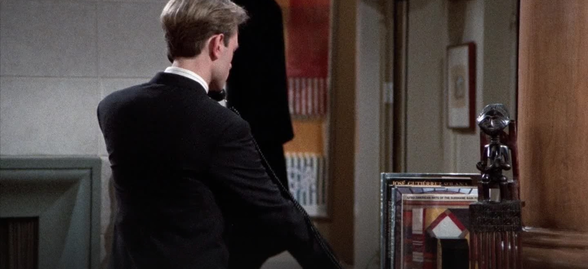
Understand the retrospective label
The Consumer Aesthetics Research Institute’s Frasurbane collection credits Evan Collins with the term and links it to Frasier and “urbane”, meaning polished and worldly. Its examples show warm colors, serif lettering, rooms and objects from the late 1980s and 1990s.
Examine the space around an object
Place a photograph beside a short title. Cover each in turn to see what the other communicates. Adjust their sizes and the gap between them to choose what readers notice first.
Learn from a working television set
The Television Academy’s tribute to production designer Roy Christopher includes David Hyde Pierce’s account of the Frasier set. His description connects its V-shaped arrangement with the actors and cameras that used the space.
Christopher’s oral-history interview discusses the set’s furniture and artwork, and includes images of the set and a model.
Apply that lesson to a webpage. Decide what someone sees first and where they look next.
Let one object disturb the arrangement
Pierce’s tribute singles out Martin’s chair as a contrast with the surrounding apartment. One mismatched object can show another person’s taste in an otherwise coordinated room.
Try this in a still life: a picture of arranged objects. Choose three plain objects, then add one personal item with a different material or color. Photograph both versions and describe what changes. Utopian Scholastic uses arranged objects to explain knowledge; Frasurbane can use them to suggest a well-read person’s home.
Give serif type enough room
Set a short title in a serif font with a clear contrast between thick and thin strokes. Make it large enough for the shapes of the letters to stand out. Then choose a smaller, comfortable reading size for the supporting text.
Line up the text along one edge. Put the caption close to its object so readers can see which item it describes. Leave plenty of space around both.
Try the title in sentence case and capitals. Compare how each version changes the tone and the amount of space it needs.
Balance warm colors across the page
Choose a pale base, a medium brown or muted olive, and a dark text color. Use the lightest color across the largest area. Use the dark color for text and a few edges, then use the middle tone to connect the object with its background.
Test the page at reading size. Small text must stand out against the paper or screen. Save slight color changes for larger shapes where they are easier to see.
For more printed texture and expressive lettering, explore Global Village Coffeehouse. Compare how each style uses warm colors and how much detail it places around the main subject.
Make a one-page collection
Choose three objects that belong to a shared activity, such as reading, listening or cooking. Photograph or draw them yourself, then give each a short title and a useful caption. Build one page around the strongest image and let the others support it.
Review the page as a whole before refining individual details. Adjust the sizes, margins and reading order until the objects feel connected. Check whether the main image still leads when you cover the headline; if it does not, increase its size or the space around it.
Explore related styles in the 90s and 2000s aesthetics collection.