Utopian Scholastic: DK, Encarta and learning by looking
Published
Utopian Scholastic describes the welcoming look of illustrated reference books and learning software. Large object photographs, white backgrounds and nearby captions let readers explore a subject piece by piece. DK’s Eyewitness books and Microsoft Encarta provide two ways into the look: a pair of printed pages to scan and a screen to explore.
On this page
Follow the page’s invitations
The Consumer Aesthetics Research Institute’s Utopian Scholastic entry connects the label to learning materials, collages of photos and traditional lettering. It also lists Encartacore as an alternate name.
In a 1994 Eye interview, Peter Kindersley and series editor Simon Adams discuss the relationship between pictures and words. The article describes object photography, white backgrounds, cut-outs and detailed captions. In Music, a dismantled Fender Stratocaster reveals parts that a photograph of the whole guitar would hide. Small notes explain the parts.
Compare this use of objects with Frasurbane, where a photographed object may establish atmosphere or taste. On a learning page, its details help explain how it works.
The main object gives you a place to begin
Choose two facing pages and find the largest image. Ask what you can learn from the image before reading the text. Its outline, material and parts may already tell you what it is. A clear image helps you connect an unfamiliar word with something you can see.
Now follow the smaller elements. Some extend the main subject through comparison. Others explain a process or reveal a hidden detail.
In our leaf diagram, the large drawing shows the whole object. Lines point to specific parts, and labels explain what to notice. On a finished learning page, those labels would explain each part in more detail.
Let captions carry real information
A useful caption tells the reader what to notice. It might identify a material, explain a feature or connect the image to a question in the main text. Give each caption one clear task so readers can learn a little each time they look.
Place the caption close to its image or join it to the image with a clear line. Leave space around small text so readers can see which image it belongs to. Put captions in the same position beside each object.
Use a large title, a clear font for the main text and smaller captions. Keep those sizes the same across the pages, even when the images change.
Move from printed pages to the screen
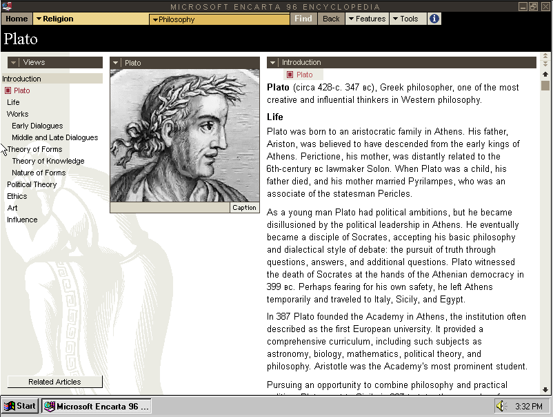
Microsoft’s own 1993 history records Encarta’s availability in March of that year. This encyclopaedia on a computer lets readers follow links, open related topics and switch between text, pictures and sound.
A useful comparison asks what the page and screen each make easy. Two printed pages let you compare several things at once. A screen can reveal more detail when you choose an item. Both need a clear main subject and useful next steps.
For a wider look at educational software, continue into 1990s educational computer games.
Make one page about an object you know
Pick a bicycle bell, a leaf, a camera or another object you can inspect closely. Photograph or draw it against a simple background. Write a short introduction that explains why the object deserves attention.
Choose three details to label. Give each detail a clear label and a concise explanation. Add one comparison image only if it helps answer a question that the main view leaves open.
Then ask someone to explore the page for a minute. Which detail attracts them first? Which caption changes what they understand? Move a caption if readers connect it to the wrong detail; replace it if it only names what they already recognize.
Explore related styles in the 90s and 2000s aesthetics collection.