Pixel fonts: Silkscreen, VT323 and Pixelify Sans
Published
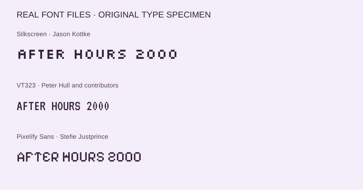
A pixel font makes each step in a letter visible. The best choice depends on the rhythm you need: compact capitals for a button, narrow terminal lettering for a status panel or a broader alphabet for a game title.
On this page
This starter includes Silkscreen Regular, VT323 and variable Pixelify Sans, plus their OFL licenses, CSS and an editable specimen. Compare your own words in all three before choosing a family and size.
Download the three-family pixel font starter — ZIP, 132 KB · Open the editable specimen
Choose the right pixel rhythm
| Family | Creator | Useful starting point | Included styles |
|---|---|---|---|
| Silkscreen | Jason Kottke | Short labels and small graphic buttons | Regular, 400 |
| VT323 | Peter Hull and contributors | Terminal-style text and narrow status lines | Regular, 400 |
| Pixelify Sans | Stefie Justprince | Broader headings and playful game text | Variable, 400–700 |
Silkscreen’s creator built a compact alphabet from a small pixel grid. Start with a short navigation label and compare the spacing between words. The 90s font guide includes its historical context and a separate starter with the Bold style.
Peter Hull based VT323 on the glyphs of the DEC VT320 terminal. The project credits later contributions from Jacques Le Bailly and others. Its narrow proportions give a status message or a list a different rhythm from the wider alternatives.
Stefie Justprince’s Pixelify Sans project supplies a contemporary pixel display family under the OFL. The included variable font covers weights from 400 to 700. Increase the weight when a heading needs more presence, then check that the inner spaces stay clear at the size you choose.
Compare the actual letters
These samples use local font files. Open the editable specimen to put the same words into every family, then move the size control to compare the result.
Silkscreen
OPEN / SAVE / PLAY
Jason Kottke · Official source · SIL OFL 1.1
VT323
Signal received: 09:41
Peter Hull and contributors · Official source · SIL OFL 1.1
Pixelify Sans
Small worlds, big ideas
Stefie Justprince · Official source · SIL OFL 1.1
Find a size that suits your screen
Begin with 16, 24 and 32 CSS pixels at normal browser zoom. Look at the vertical stems, diagonal steps and small enclosed spaces. Move through neighboring sizes when an edge looks uneven; the browser’s rasterization and the screen’s pixel density both influence the result.
Test words that contain the letters and punctuation your project actually uses. A heading with a single word asks a different question from a date, an email address or a paragraph. Check accents and symbols in the editable specimen before you commit to a family.
Give short pixel labels a little breathing room through line height and surrounding padding. Use a comfortable reading face for longer explanations when the stepped texture starts to compete with the words. The pixel art beginner guide applies a similar idea to drawing: let each deliberate mark support a clear shape.
Distinguish a pixel style from an image
These font files render selectable text. Copying the words into another app keeps the characters; the pixel shapes appear only in apps that use that font. A PNG badge fixes its letters into an image. Use live fonts for headings and navigation that may change; use a badge for a composition that needs fixed dimensions. image-rendering: pixelated affects raster images, so it cannot sharpen live font text.
Load the font and keep the text editable
The starter’s CSS uses @font-face with local files. Keep its fonts folder beside the stylesheet, then apply the family where you want it:
@font-face {
  font-family: "Pixelify Sans";
  src: url("fonts/PixelifySans-wght.ttf") format("truetype");
  font-weight: 400 700;
  font-style: normal;
  font-display: swap;
}
.game-title {
  font-family: "Pixelify Sans", sans-serif;
  font-size: 32px;
  font-weight: 500;
  line-height: 1.25;
}
MDN’s font-face reference explains the loading rules. For a PNG button or other raster graphic, image-rendering: pixelated controls how the browser enlarges the image. Scale a small PNG by a whole-number multiple to preserve an even grid.
Each included family carries SIL OFL 1.1. The starter keeps the copyright notices and licenses beside the fonts; retain those files when sharing it. Back to the 90s shares the original layout and CSS under CC BY 4.0.
Browse the 90s and 2000s aesthetics collection for the histories behind these visual choices.