Grunge typography: David Carson, texture and reading
Published
Grunge typography gives letters rough edges and puts them in unexpected places. Uneven lines and sudden changes in size can make a music page feel restless. David Carson’s Ray Gun layouts show why the arrangement matters as much as a font that looks worn.
On this page
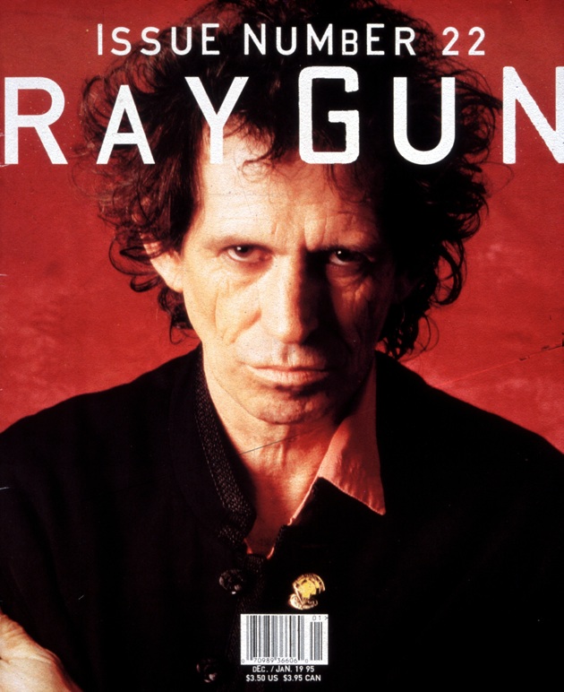
Explore David Carson’s Ray Gun layouts
Carson’s studio archive presents a selection of Ray Gun layouts and covers, including imagery associated with David Bowie and Frank Zappa.
Choose one layout and identify the actual subject, headline and publication information. Notice which part stands out first. The magazine’s tone comes partly from how it combines the performer, the picture and the words.
For an account from the time, read Rudy VanderLans’s 1995 essay “Radical Commodities”. He links the growing audience for unusual fonts to Ray Gun. He also describes designers selling fonts by modem, a device that connected computers over phone lines. A small font studio could use the same computer to make letters and sell them. Compare its context with Emigre’s magazine archive.
Look at the page design as well as the font
In a 2019 interview with David Carson, Eye on Design revisits his 1994 Bryan Ferry interview set in Zapf Dingbats. Zapf Dingbats uses symbols instead of letters, so readers cannot read the interview as normal text. This choice changes more than the rough edges often linked with grunge type.
Compare it with Barry Deck’s Template Gothic, whose letters have uneven outlines. Set a readable paragraph, then make three separate versions: change the font, move the lines out of alignment, or add texture that looks photocopied. Keeping those changes separate reveals which one produces the effect you actually want.
Separate the structure from the texture
Cover the small details with your hand or view the page at a reduced size. What remains? A large dark area, an angled line of type or an unusually placed image may give the page its basic shape.
Now return to the texture. A rough edge can suggest pressure, wear or a poor-quality copy. A small break can make you pause within a word. A dense patch can make one area feel heavier than another.
Keep the smaller text readable when you distort a headline. Readers still need to find the practical details.
Match the lettering to the subject
Start with a sentence that has a clear tone. It might describe speed, hesitation, repetition or an interruption. Change the lettering in a way that fits that meaning.
A repeated word can create insistence. An abrupt change of size can suggest a sudden emphasis. A wider gap can introduce a pause. Work with one of those actions at a time so you can see what it contributes.
Then compare the result with a plainly set version of the same sentence. Ask what the arrangement adds to the words.
Keep text readable at different distances
A page can work differently from across the room and at reading distance. A large headline may first operate as a shape. A closer view can reveal its wording, its texture and the relationship with smaller text.
Make the essential name or title large enough to recognize. Put the other details nearby so readers can find them next. Use contrast and spacing to help the reader move between the two.
This principle also matters on a screen. Test a layout at a narrow width and at the actual size of its smallest text. Let the expressive headline stand out. Use a plain background and clear font for longer passages.
Make a one-page music response
Choose a piece of music and write three short observations about its beat, how many sounds overlap and where it grows louder or quieter. Create an original poster using one sentence from those notes.
Build the first version with plain black type on a light background. Choose the text sizes and what readers should read first. For the second version, introduce one disruptive choice: an angle, a repeated fragment or a controlled rough edge. Keep both versions so you can judge the difference.
A photograph, if you use one, should contribute another part of the subject. Place it near the words it helps explain and credit its creator.
Compare the visual routes through music
Pen & Pixel builds scenes around performers with layers of photos and bold lettering. Rave flyer design gives an event its own look while sharing the details. Carson’s layouts use the position and shape of words to express the music.
Compare one headline across the three approaches: does the lettering set a reading pace, look like a material or give a night its own character?
Explore related styles in the 90s and 2000s aesthetics collection.