Early Cyber: April Greiman, pixels and digital type
Published
Early Cyber puts the computer’s building blocks on show. Designers enlarge pixels, the tiny squares in screen images, and mix text with digital pictures at sharply different sizes. April Greiman’s work and Emigre show designers using those features in print as well as on screens.
On this page
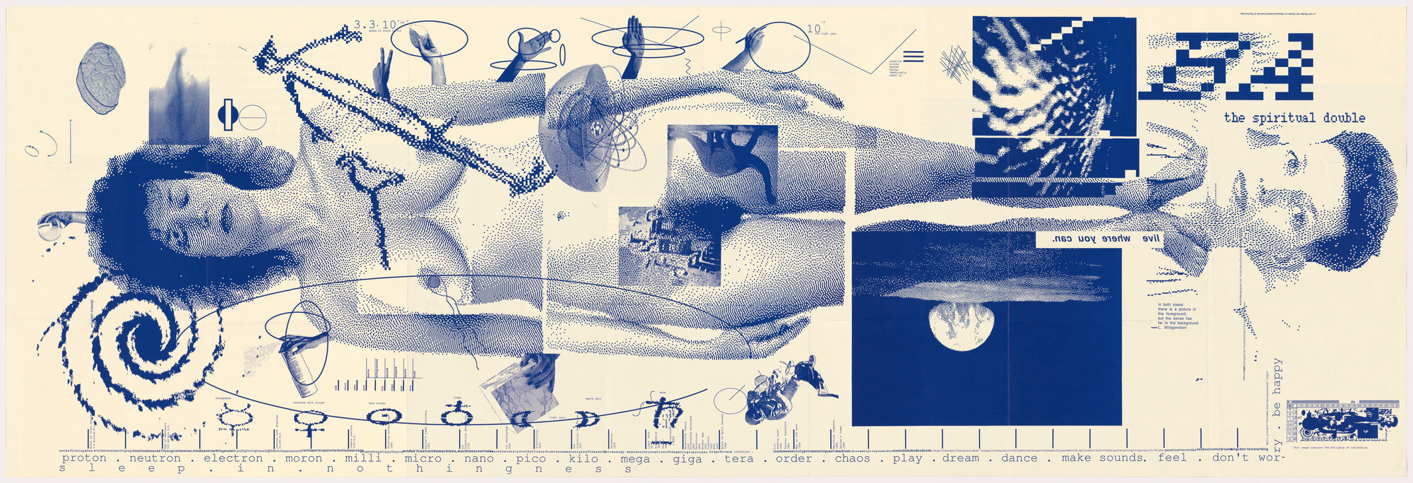
Explore April Greiman’s folding poster
April Greiman created Does It Make Sense? as a large folding poster for the 1986 Design Quarterly issue. Her own account describes how she brought images into the computer and used MacPaint, MacVision and MacDraw. She arranged the pictures and text at different sizes.
The Consumer Aesthetics Research Institute’s Early Cyber entry places Greiman alongside Susan Kare, Emigre and other early digital references. These experiments came before the glossy designs around 2000. They show how designers learned to use the computer’s visible pixels and drawing tools.
Keep the 1980s part of the story visible
Greiman describes taking images from video, drawing on a Macintosh and joining LaserWriter printouts to make the folding work. She used the computer to gather images and arrange the page, then made a printed object.
Compare that process with the small pixel icons studied here. An icon solves recognition within a tiny grid. A Greiman-inspired page can enlarge that grid, mix it with other images and use the change in size to draw attention. For each reference, identify what began on a screen, what came from a camera and what the printed page changed.
A pixel can be both a limit and a choice
On a small grid, you have to choose which details to keep. A line may need to move by a whole unit. A curve may need several steps of different lengths. When you enlarge that image, the decisions become visible.
Draw a small symbol, enlarge it with crisp edges and place it beside a large word. Adjust their sizes so you can see both clearly.
Look at type as part of the experiment
Emigre’s magazine archive lets you compare issues from the early digital years. MoMA’s collection record for issues 1–69 names Rudy VanderLans and Zuzana Licko. It describes how they used the magazine to try new digital designs.
Choose two covers or spreads and compare how the type occupies the page. Look at changes in scale, alignment and density. A block of small type can become a texture at one distance and information at another. A large letter can become a shape you notice before you read it.
Follow the tools through the result
When studying a period example, write down the named software and printing method beside the title and date. Then choose a detail that interests you: a pixel edge, a repeated shape, a stretched image or the space between text and picture.
A designer may choose a rough image to make its pixels stand out. A smooth image uses the same grid but hides the steps. Ask what showing or hiding the grid adds to the page.
Metalheart draws attention to depth. Glitch art explores breaks and errors in images. Pixel art uses the grid for detailed drawing.
Make a page that shows its construction
Create a 32 × 32 drawing and a 256 × 256 version of the same subject. Enlarge the smaller one eightfold with nearest-neighbor scaling, which keeps the pixel edges sharp. Both images will then fill the same space. Place them beside one short sentence. Side by side, you can see steps in the enlarged image that are too small to notice in the other.
Use the arrangement to explain an idea: a shift in distance, a change in time or a movement from detail to whole. Save the first layout before changing it. The comparison will show which choices come from the source material and which come from the way you organize it.
Explore related styles in the 90s and 2000s aesthetics collection.