90s rave flyers: dates, typography and visual design
Published
A 90s rave flyer had to build excitement and share useful details on one small sheet. Strange images and bold lettering gave the night its own look. The line-up, venue, date and entry details helped someone make a plan.
On this page
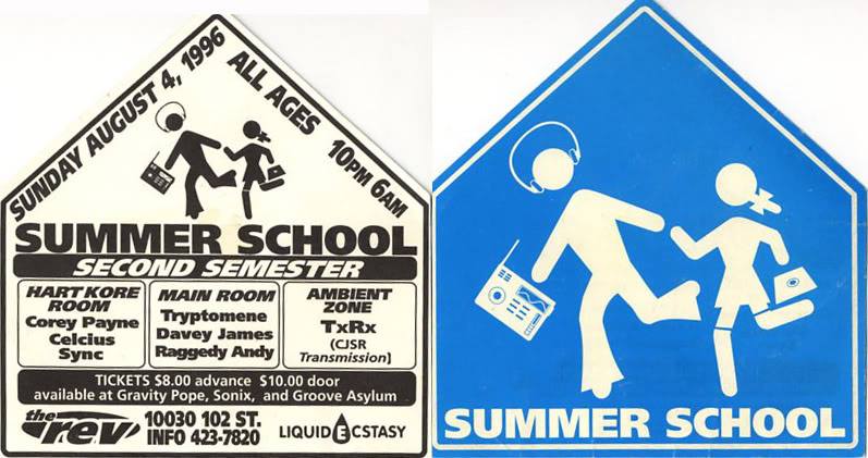
Explore dated rave flyers
The collector-run Rave Preservation Project records Quasar in London on 6 June 1992. It also lists Mantra in Brighton on 25 September 1992 and Eden in Hampshire on 1 November 1991. Begin with those event details, then compare the graphics.
Make a reference sheet you can use
Put four fields below each flyer: event, date, place and archive record. Then mark the event name, line-up and practical details in different colors on a copy. This shows how much space the designer gives to the image, performers and practical details.
Read the information in layers
First identify the element that would catch your attention from a distance. It might be a title, a face, a symbol or a striking mix of colors.
Next, locate the line-up and event details. Compare their sizes and positions. How much space goes to the event title, and how much to the performers’ names?
Finally, find the smallest practical information. People may keep the flyer to check it later. After the title catches their eye, they need to find the date, place and entry details.
Follow the image’s promise
An event name can suggest a place, a journey, a state of mind or a technical signal. The image can reinforce that suggestion through size, lighting, shapes or a repeated symbol.
Write down the relationship in one sentence. For example: “The large circular form makes the event name feel like a destination.”
You can also ask how much the image reveals. A clear subject suggests a specific place or idea. Abstract shapes leave more room for the viewer to imagine one. In both cases, the title and event details should tell people what is happening.
Color and type establish the rhythm
Choose two or three main colors from a flyer and compare how much space each fills. A small bright patch can catch the eye first. A large dark area can make a small glowing shape stand out.
Use a large event title, a medium line-up and small text for the details. These sizes show readers what to read first. Angled lines, outlines or wide letters can add variety while keeping that order clear.
Compare Vectorheart’s graphic systems with grunge typography to see two ways to give music graphics a distinct look. Use the comparison to describe particular features of a flyer, alongside its own date and scene.
Design a fictional night on paper
Invent a title and write a short note about the mood you want to create. Use a fictional venue and clearly label the piece as a design study. Decide which information would matter first to its imagined audience.
Use a 105 × 148 mm canvas. Set the title, line-up and details in black and white, then add one image or geometric idea connected to the name. Print at 100% size. From arm’s length, find the title; close up, find the date, venue and entry information without turning the sheet around.
Keep a second version with different lettering while preserving the same wording. If a detail takes too long to find, move or enlarge it before changing the decorative image.
Explore related styles in the 90s and 2000s aesthetics collection.