Cybertwee: the 2014 collective, softness and web art
Published
Cybertwee brings tenderness, cuteness and femininity to art and communities on the web. Its soft colors belong to a group of artists with a manifesto, a shared statement of their ideas, and a gallery on screen.
On this page
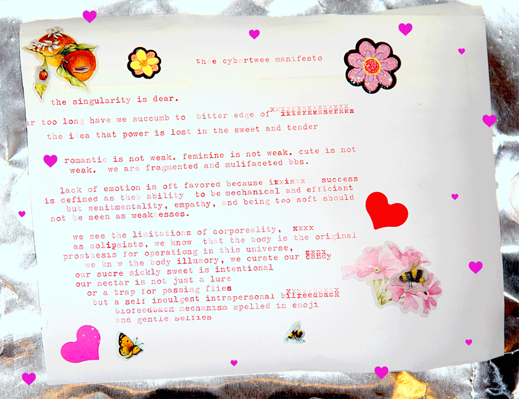
Gabriella Hileman, Violet Forest and May Waver founded the collective in 2014. May Waver’s archive preserves their shared manifesto and a reading from that year.
Start with the collective’s own work
Violet Forest’s page for the Cybertwee HQ describes the group’s interest in femininity, technology and community. Their digital headquarters is a 3D gallery on an island. A reflective sea surrounds it beneath a night sky.
The page names artists in the first exhibition, including Emily Mulenga, Jessica Dolence, Maya Ben David and manuel arturo abreu. It also includes historical work by VNS Matrix.
Connect the manifesto to the gallery
Read the manifesto, then inspect the headquarters’ arrival screen and exhibition credits. Find one way the gallery puts an idea from the statement into practice. Look at its words, the path through the works or how it credits artists. Compare that choice with Webcore’s personal homepages, where the author’s own links and interests organize the visit.
Notice how softness changes an invitation
Pale colors, small symbols and a playful title can make a page feel friendly or personal. Empty space gives visitors room to pause. A personal sentence lets them hear the author’s voice.
A friendly-looking page also needs clear links, readable text and useful descriptions. These help visitors find their way around.
Look at a page you enjoy and find where its look and links work together. Perhaps a friendly introduction leads directly to a small gallery. Perhaps an artwork credit offers an easy path to its maker. Describe what makes you want to stay.
Look at how the gallery connects people
The order of pieces, the distance between them and the information beside each one can shape how a visitor understands the group.
Cybertwee HQ gives the group a shared island setting and names each contributing artist. How could your own site show your taste while making room for other people?
A small website can answer that question with simple means. You might create a themed collection, link to the makers who influenced it, or invite contributions around a precise prompt.
Compare related digital moods
Webcore explores personal pages shaped by their authors’ interests. Vaporwave reworks older music and advertising images. Neo-Y2K follows artists who remake graphics from around 2000 in their own styles.
A pale color can look cosy, artificial or faded with age, depending on the pictures and words around it. Decide which effect you want, then choose the rest of the page to fit.
Make a small digital room
Choose a theme that can hold three things you care about: a photograph, a piece of writing and a link to another artist. Give the collection a clear title and write a two-sentence welcome that explains why you brought the pieces together.
Choose one background color, one text color and one accent. Draw a small symbol of your own, such as a star, leaf or cloud. Repeat it sparingly to connect the sections.
Add a short caption to each piece and a visible creator credit where another person contributed. Give every link a meaningful label. Then ask someone to explore the page and tell you what kind of place it feels like.
Ask the visitor to find the three pieces and their creators. Revise any caption or link that leaves them unsure where to go next.
Explore related styles in the 90s and 2000s aesthetics collection.