Retro Windows UI kit: a free HTML and CSS desktop
Published
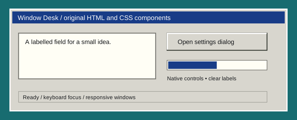
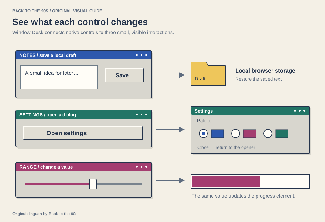
Build a little desktop around your own content. Window Desk supplies bevelled windows, title bars, toolbars, form fields, status strips, a table and a modal dialog. The downloadable demo connects those pieces to working controls: hide and restore windows, change the palette, adjust a range slider and save a plain-text note in your browser.
On this page
Open the editable demo · Download the UI kit.
Start with the three source files
The package keeps appearance and behavior easy to find:
| File | What it contains |
|---|---|
ui.css |
Color tokens, borders, component spacing and responsive layout |
demo.html |
The complete desktop and its semantic HTML |
demo.js |
Hide/restore actions, local notes, palette controls and the dialog |
Extract the ZIP and open demo.html. Use the Notebook, Controls and Files buttons at the bottom to restore a hidden window. In Control samples, choose a title-bar color and move the level slider. The progress sample follows the slider so you can inspect both controls together.
The notebook’s Save on this device button keeps the text in this browser’s local storage. Enter Test note, save, reload, and confirm the text remains. Then choose Clear note, reload again, and confirm the editor is empty. These steps check both persistence and removal.
Give a section a window frame
Copy ui.css into the same folder as your page and add this inside <head>:
<link rel="stylesheet" href="ui.css">Then add a labeled section, title bar and content area in <body>:
<section class="wd-window" aria-labelledby="notes-title">
  <div class="wd-title">
    <h2 id="notes-title">My notes</h2>
  </div>
  <div class="wd-content">
    <p>A small place for an idea.</p>
  </div>
</section>
Add a real button when the window needs an action. The demo’s hide button uses JavaScript to hide its section and move focus to a matching restore button. That explicit connection makes the control useful for keyboard users as well as pointer users.
For a gallery, replace the paragraph inside .wd-content with your images and captions. Keep aria-labelledby="notes-title" matched to the heading’s id, or rename both together when adding another window.
Use the native controls
The kit styles ordinary HTML buttons, inputs, selects, radio buttons, checkboxes and progress elements. Labels describe their purpose; the browser supplies their familiar keyboard behavior. The table keeps headings and cells in a real table structure, and the narrow-screen wrapper allows it to scroll when it needs more room.
The settings example uses the HTML dialog element. JavaScript calls showModal(), and a form with method="dialog" closes it. MDN’s dialog reference explains the browser’s modal behavior, focus handling and dismissal mechanisms. The demo gives the dialog an accessible name through its heading. showModal() asks the browser to treat the rest of the page as inert while the dialog is open; the native dismissal behavior includes Escape. Keep the element and its label when you change the visual frame.
When you adapt a component, preserve its label and choose the element that matches its job. Use an anchor for a destination and a button for an action. A decorative bevel can sit around either.
Change the desktop’s character
The custom properties at the top of ui.css control the desktop, panel face, text, light edge, shadow, title bar and input surface. Start by changing --desk and --title. Then check the title text against the new color before adjusting smaller details.
The default interface uses a teal desk, warm gray panels and blue title bars. The demo’s plum and forest choices show how one color can shift the mood while the controls keep their structure.
The .wd-desktop grid places windows in two columns on a broad screen and one column on a narrow one. You can also use the components inside your own layout. Keep the reading order sensible when you move windows visually.
Take the kit into a project
Try a small, complete idea first: a reading log, a personal links desktop or a control panel for your own illustration. Use the Neocities templates if you want a multi-page site around it.
For another approach to this visual tradition, explore 98.css, an established CSS library with its own component system.
Before sharing your version, follow the keyboard route through every action, inspect a narrow screen, open and close the dialog, and check the save-and-clear flow with sample text. The package’s README includes that review sequence.
We release the original component code, demo and SVG artwork under the MIT license. Keep the license with copies you distribute.