Windows XP design: Luna, color and desktop icons
Published
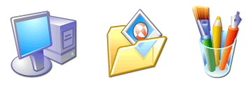
Windows XP’s blue title bars, green Start button and rounded highlights made the desktop look unusually vivid. Its icons continued that change at a smaller scale: rich color, angled objects and soft shadows suggested things you could pick up.
On this page
The style’s name was Luna. Look at the window frame and icons separately. Both suggest depth, but their different sizes call for different details.
Read the real interface
Microsoft Design’s Windows design history shows XP desktop and sign-in images. Its account credits designers Harold Gomez, Jeremy Knudsen and Kim Sealls.
In the desktop view, compare the window’s edge with the photograph behind it. A large title area separates the task from the wallpaper. Inside the window, plain backgrounds make labels and lists easier to read.
The sign-in screen puts a picture beside each account name. The image helps you spot an account, while the text identifies the person.
Luna had a decoy
Raymond Chen’s development account explains that the design team kept Luna secret. Programmers still needed a style to test, so the team gave them a public decoy called Mallard. Other people began copying that temporary design before the final look appeared.
That story helps explain why early XP screenshots can look unlike the desktop people remember. A beta, or test release, shows one stage of the design process. It may not show a color choice included in the finished product.
Follow a consistent light source
XP-style buttons often have a lighter upper edge and a darker lower edge, with a gradual color fade between them. Rounded corners soften the outline. Use the same light direction across nearby controls so their depth looks consistent.
Try the same button three ways: flat, with raised edges, and softly rounded with a gradient (a gradual color fade). Keep its label and size unchanged. Compare them at actual size. Which edges make the shape clearer, and which highlights distract from it?
Why the icons looked smoother
The Windows User Experience Team’s July 2001 icon guide calls for rich color, clear outlines and light from the upper left. It describes 32-bit artwork with an alpha channel, which controls how see-through each pixel is. It gives icon sizes of 16, 32 and 48 pixels.
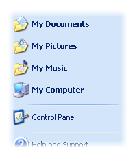
This transparency lets a shadow fade into different backgrounds. A firm outline helps the object keep its shape, especially at 16 pixels. A folder’s outline can stay clear even when page lines or tiny controls disappear.
Place one of the original notebook icons on white and deep blue. Compare the 16-pixel shape with the 48-pixel highlight and shadow. Enlarging the small file cannot bring back detail that the small drawing leaves out.
Borrow the structure as well as the surface
XP windows often put related tasks beside the main content. Try this on a personal page: keep a clear central area and a short set of actions such as Download, Edit or Compare.
Use the comparison worksheet to draw the same note window twice. Keep the title, text box and save action the same. Change the gray, sharp-edged look to a rounded blue one.
The icon tutorial explains how to draw the small icons. The Windows 95 and 98 study shows the earlier style for comparison.