Microsoft Bob: the 1995 room interface and its guides
Published
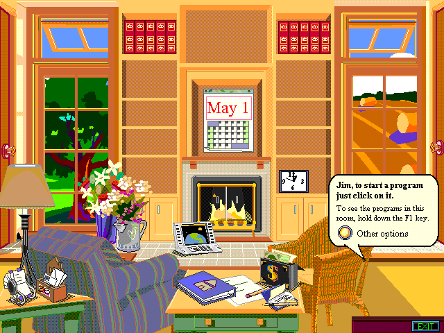
Microsoft Bob presented computer tasks as objects in a cartoon home. A calendar opened a schedule; a notebook led to writing; animated guides explained the next step. Microsoft aimed the software at people buying a home computer for the first time.
On this page
Bill Gates announced Bob at the Consumer Electronics Show on 7 January 1995, according to Microsoft’s history.
A room could organize the tasks
Terry Winograd’s contemporary profile describes Bob’s home setting and its audience of new computer users. Familiar objects led to planning dates, paying bills and writing letters.
Each task stayed in one place in the room. Someone could remember the calendar above a fireplace more easily than an unfamiliar app name.
Bob built on earlier work. Winograd points to room-based HyperCard projects, Magic Cap and Apple’s eWorld. Bob brought household apps and animated guides together in the same home setting.
The guides changed how they spoke
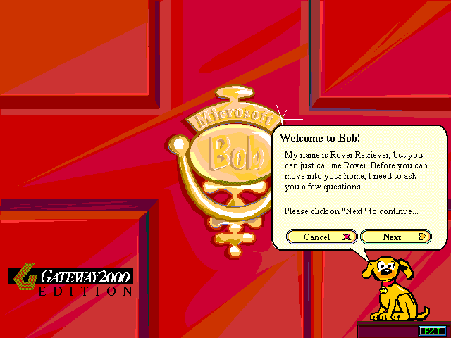
Bob’s cast included Hopper the rabbit and Ruby the parrot. Winograd links these characters to Clifford Nass and Byron Reeves’s research on how people respond socially to computers. Your chosen guide changed the wording and tone of its help. It also moved while waiting for you to act.
The box supplied Bob Magazine instead of a standard manual. Its magazine-style pages included setup instructions.
Where the metaphor helps—and where it becomes work
A room suits a small number of distinct activities. Each object has space and a recognizable purpose. As the number grows, visitors must scan more decoration, remember more positions and work out which objects open something.
The same choice matters on an illustrated personal homepage. A bookshelf can open a reading list, but a library with hundreds of entries also needs a list you can search. Label each link clearly and make decorative objects less prominent.
Try the original three-task room
Open the original room study. Its labeled notebook, calendar and envelope buttons open writing, scheduling and letter panels.
Choose the notebook and type a sentence. Open the calendar and pick a date, then visit the letter panel.
Download the source and replace one task. A radio could open a music collection; a bookshelf could open a reading list. Keep both the object and its text label. Press Tab to move through the buttons and check that you can use the room with a keyboard.
Give the scene a manageable purpose
Choose three activities for a desk, workshop or bedroom scene. Sketch the same choices as a plain list. Compare how quickly you can find each one. The room gives each task a memorable place; the list shows all the choices in less space.
Clippy shows a later approach to animated help. A browser companion can walk, blink and rest beside the content on an illustrated page.